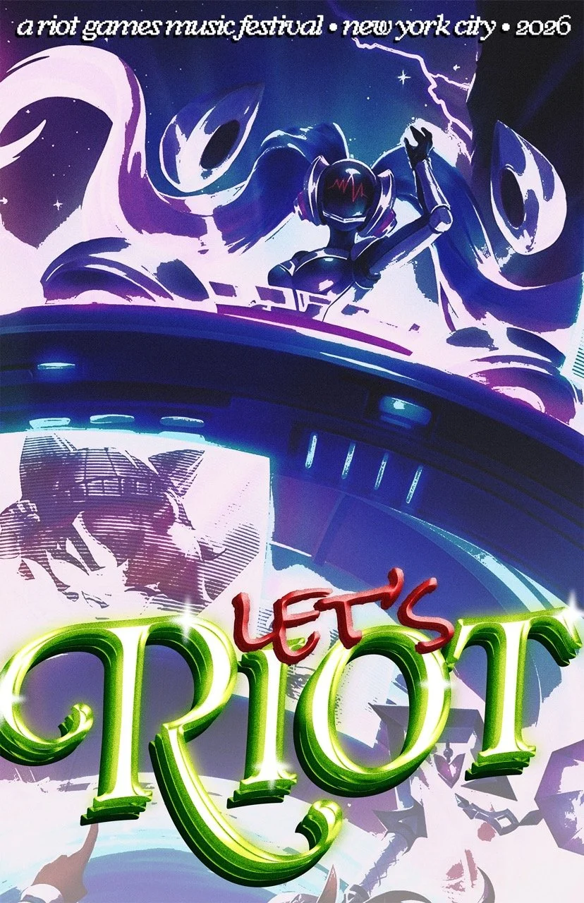
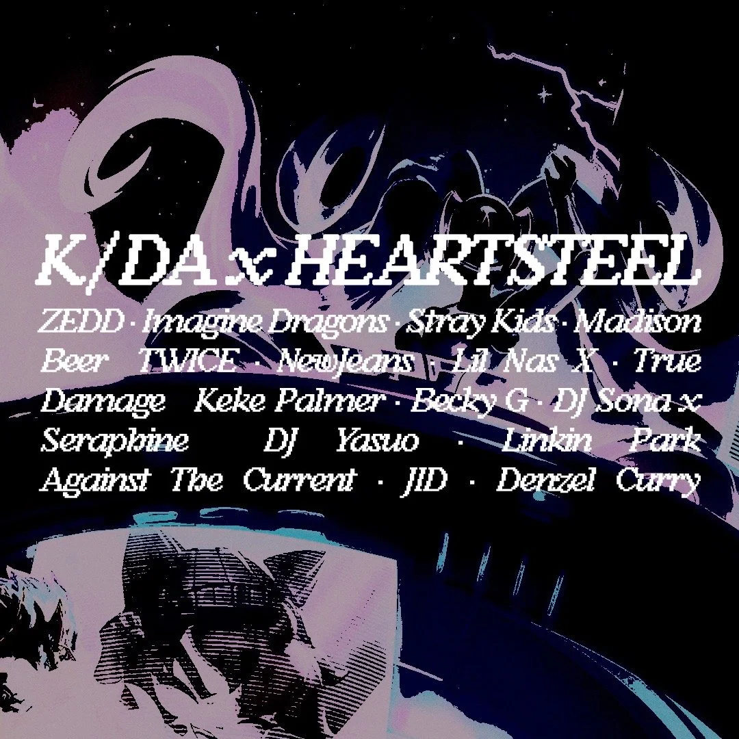
LET’S RIOT

DESIGN
✩₊˚.⋆☾⋆⁺₊✧
DESIGN ✩₊˚.⋆☾⋆⁺₊✧
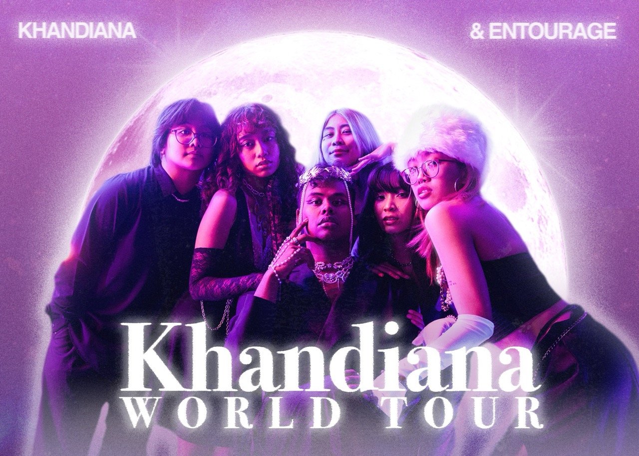
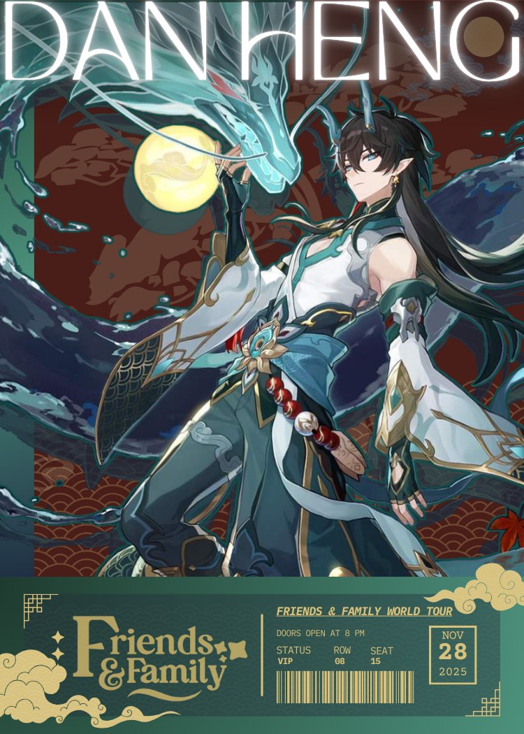
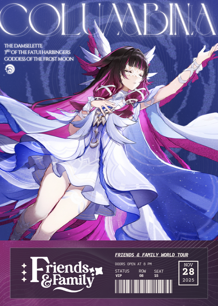
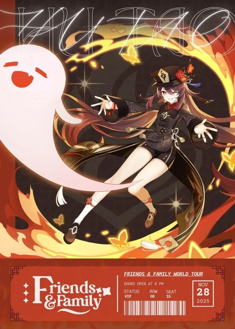
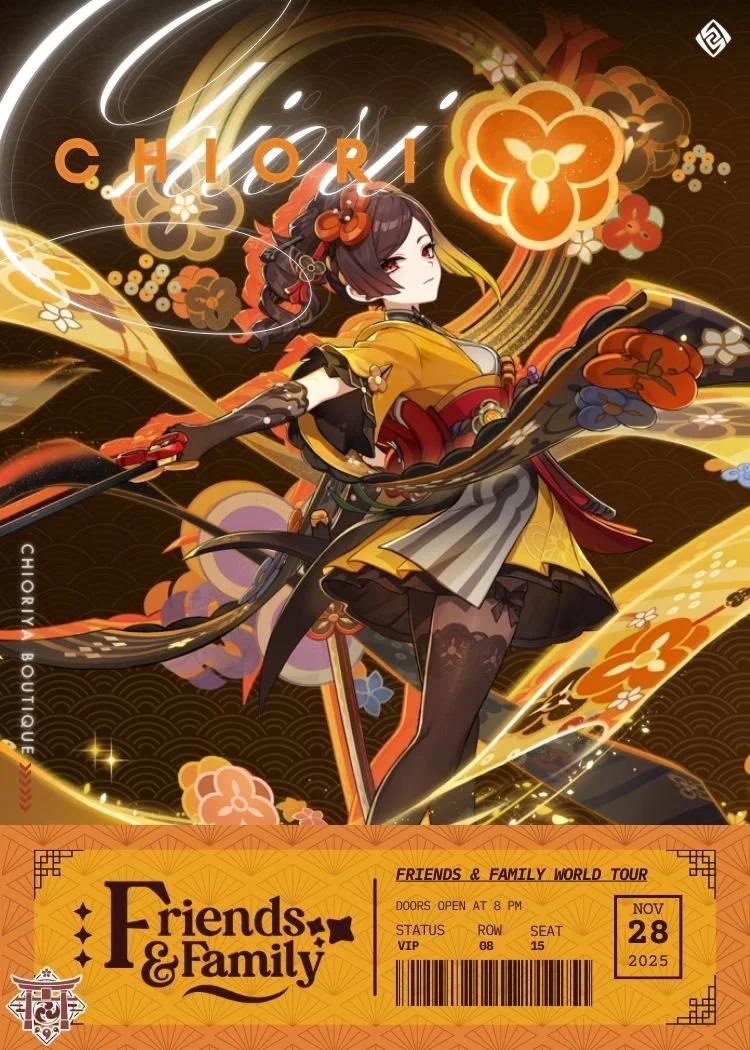
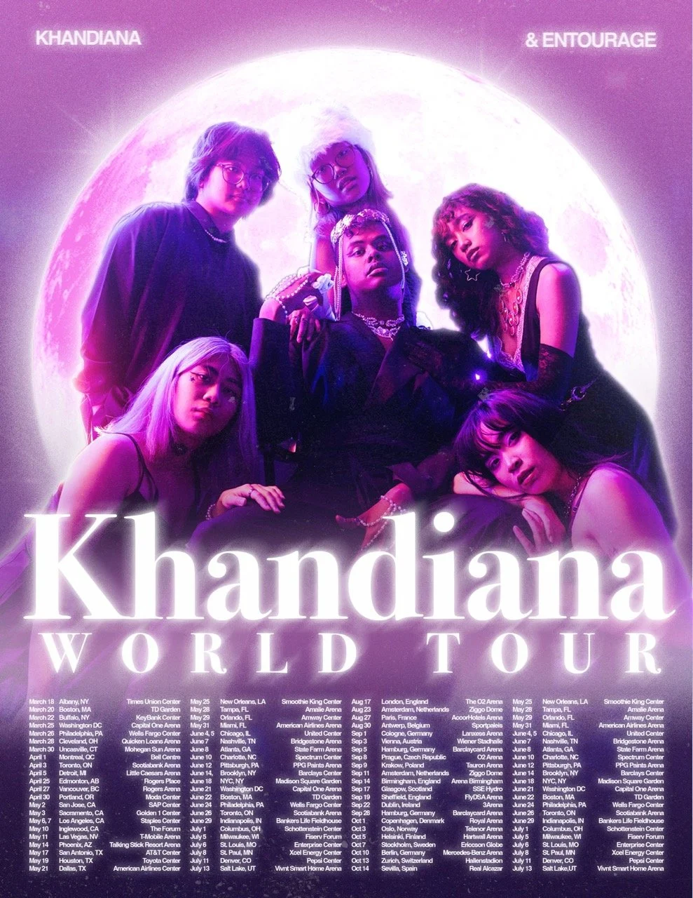
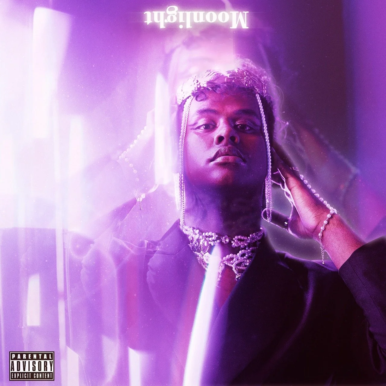
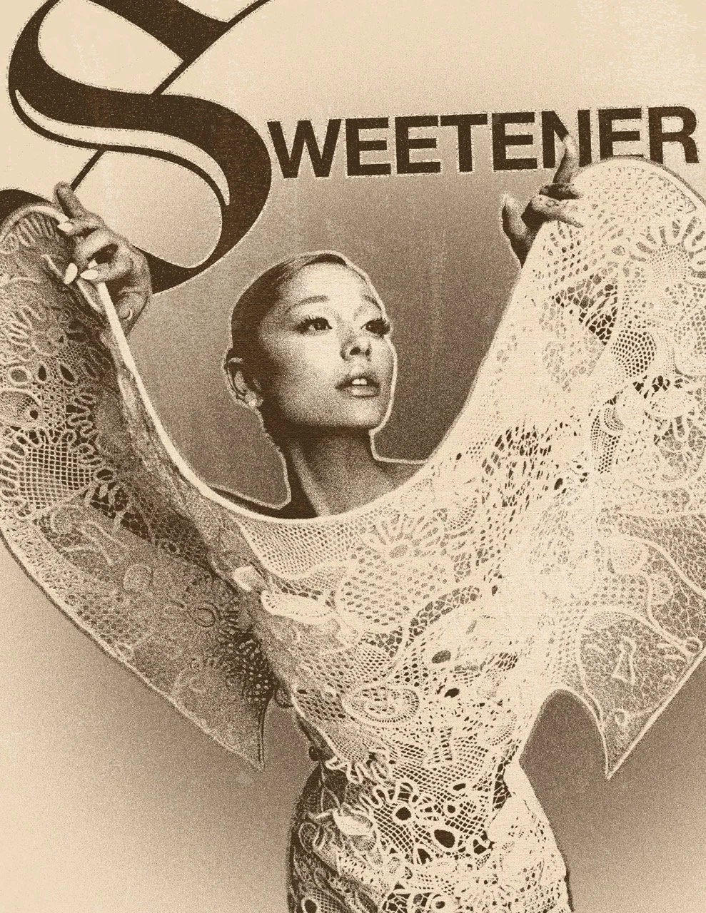
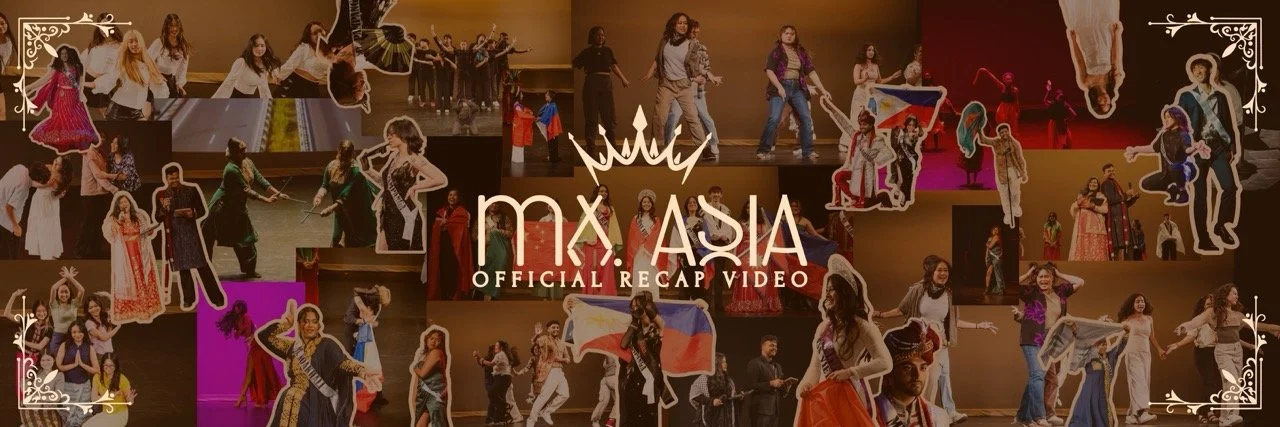
KHANDIANA WORLD TOUR
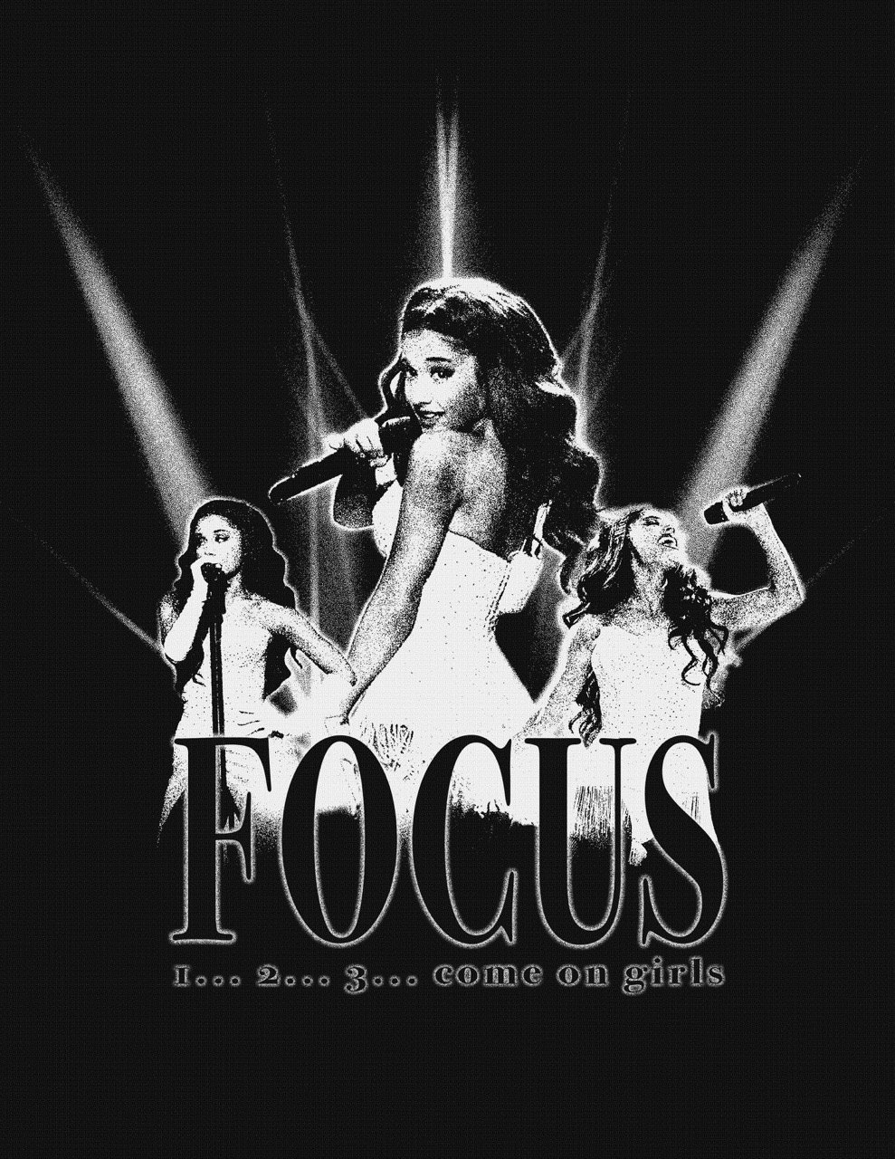
Khandiana World Tour is a concept I created to market my performance sets for a pageant that I competed in! As someone who is heavily idolizes Hollywood and American pop artistry, I was inspired by the creative direction of Ariana Grande’s Sweetener era. While a lot of the visuals alluded to the Italian Renaissance, others referenced celestial bodies and night skies. Evenmore, she had a huge, inflatable moon present in every show on the Sweetener World Tour. In these set of graphics, you’ll notice some celestial bodies, including the moon and subtle galaxies and stars. The use of pink and purple lights are inspired by the creative direction of the 7 rings music video. Glow effects and noise are used a lot throughout the design—not only is it a personal preference of mine but is used by a lot of contemporary graphic designers. Immerse yourself in the full creative project that is Khandiana World Tour! Performances can be found here!


more WORKS


SPOTLIGHT
SPOTLIGHT
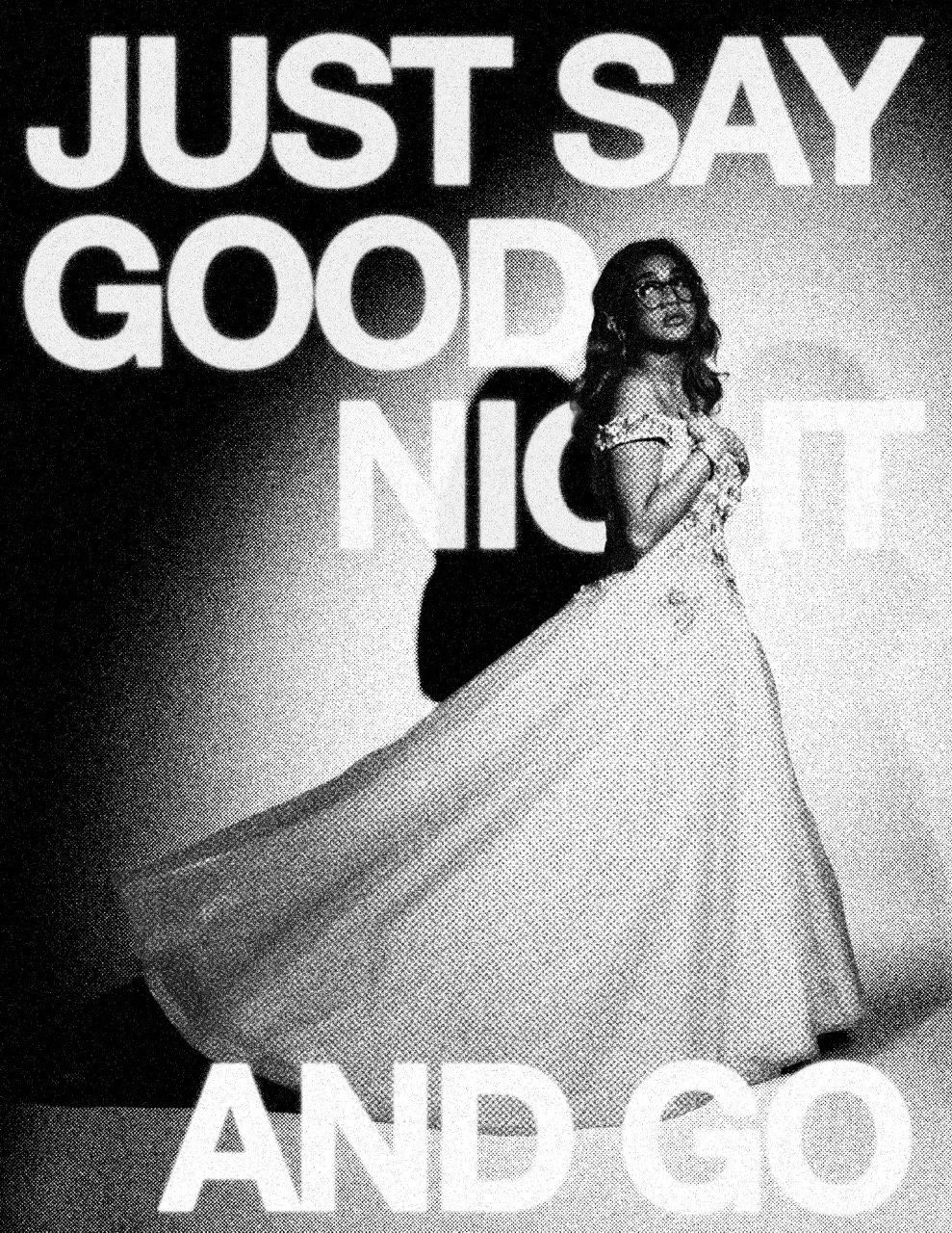
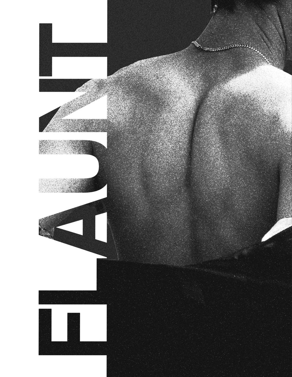
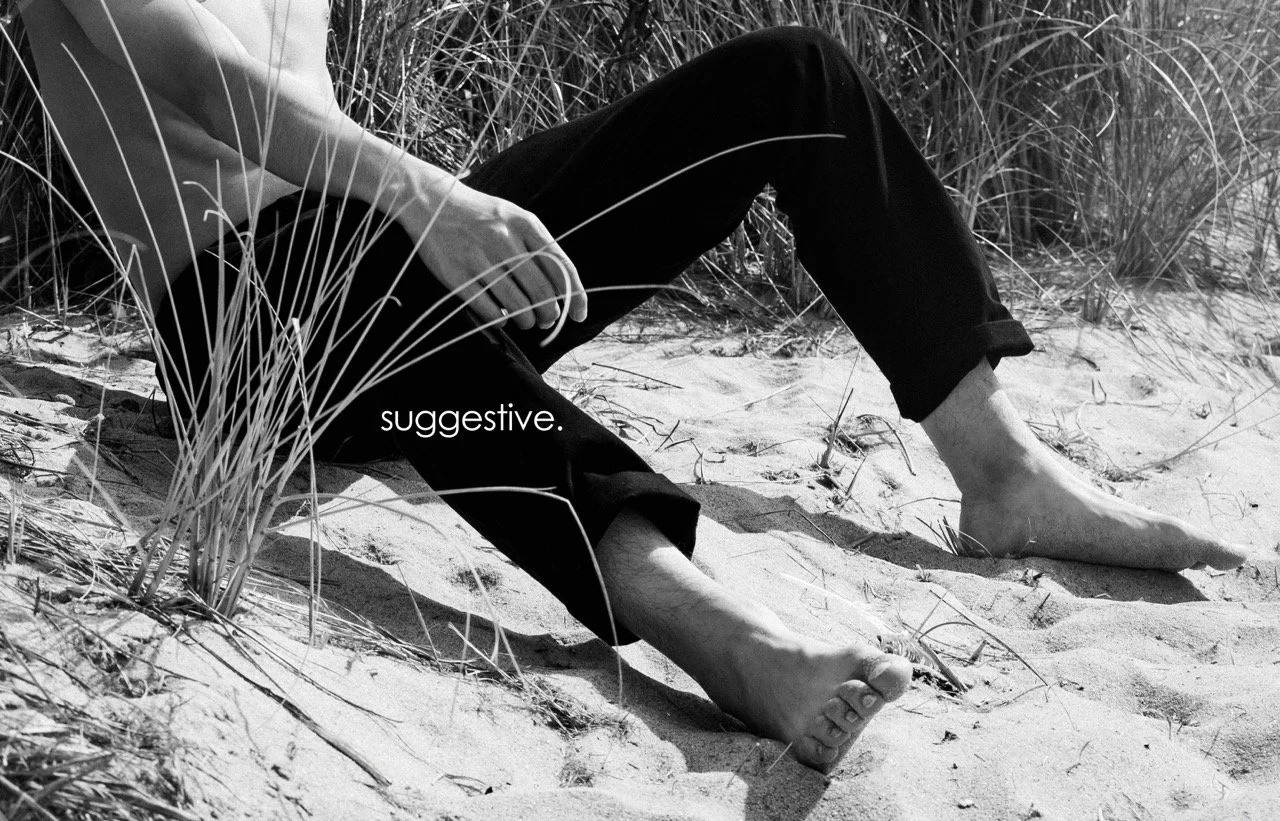
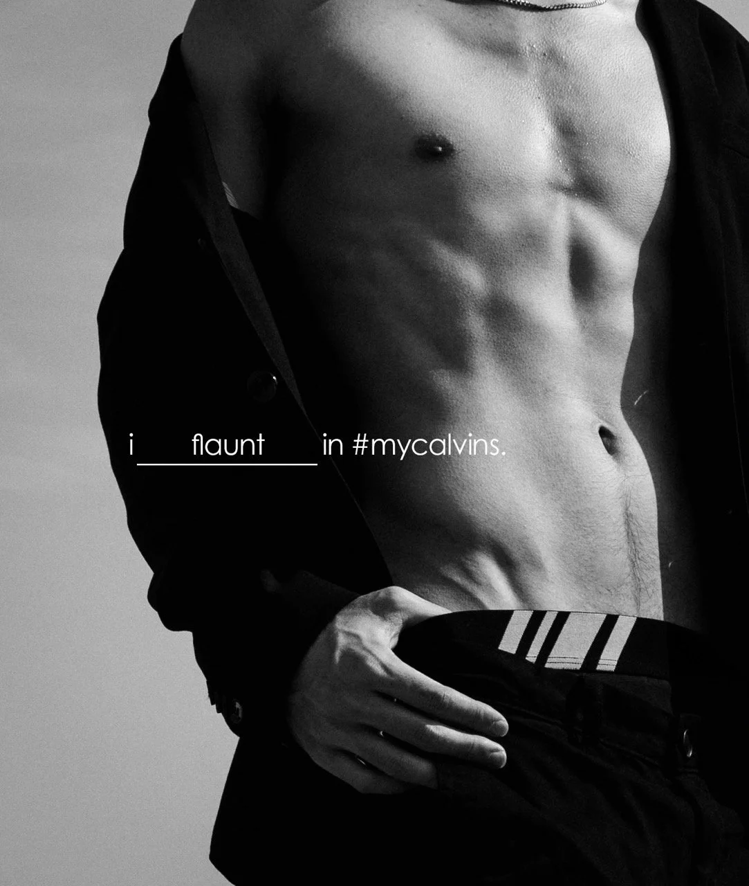
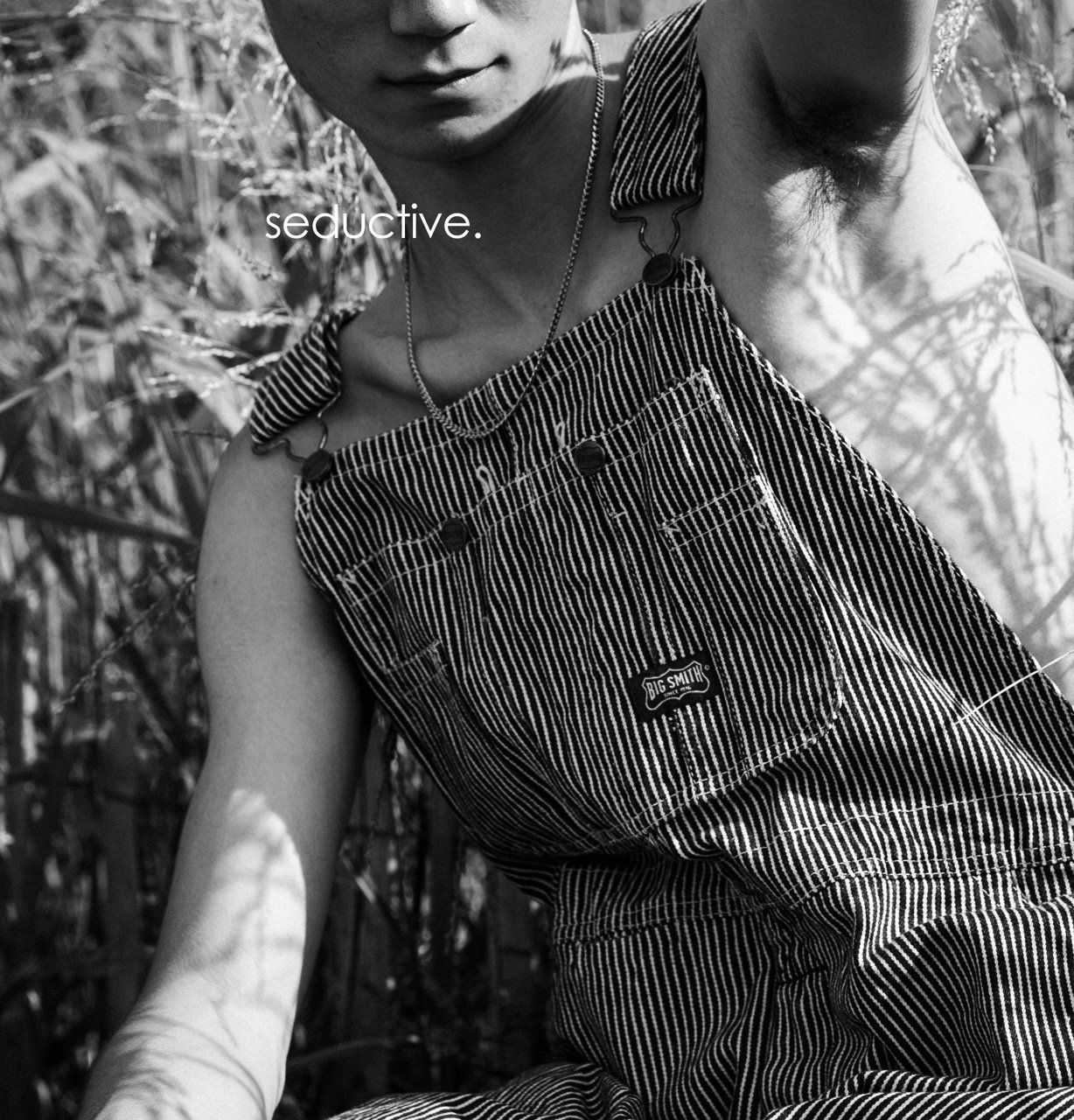
FLAUNTING
IN #MYCALVINS
This photoshoot is heavily inspired by Calvin Klein’s line of black & white ads, with my own twist. I wanted to deliver a sense of sulture and sensuality with a bit of mystery. The composition of the photos are cut in a way where the focus lies on specific body parts. The first three designs emphasize a posterized-magazine cover look while the other three designs stay truer to the typical #mycalvin ads.


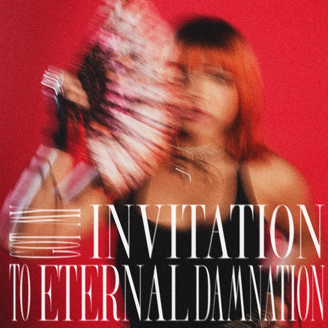
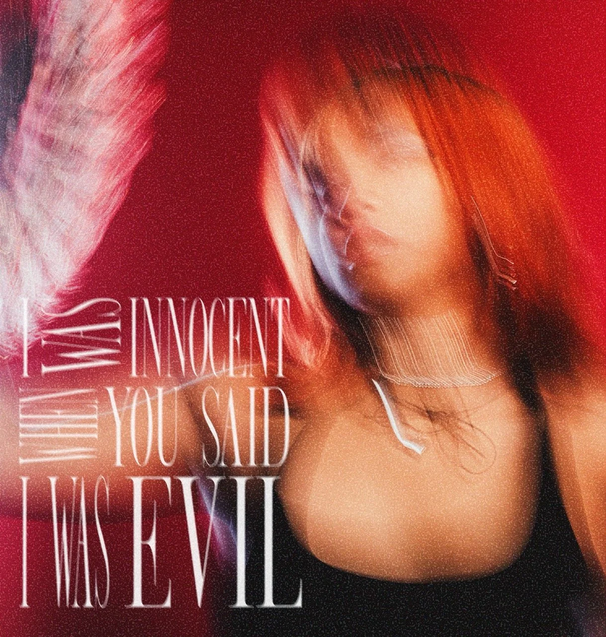
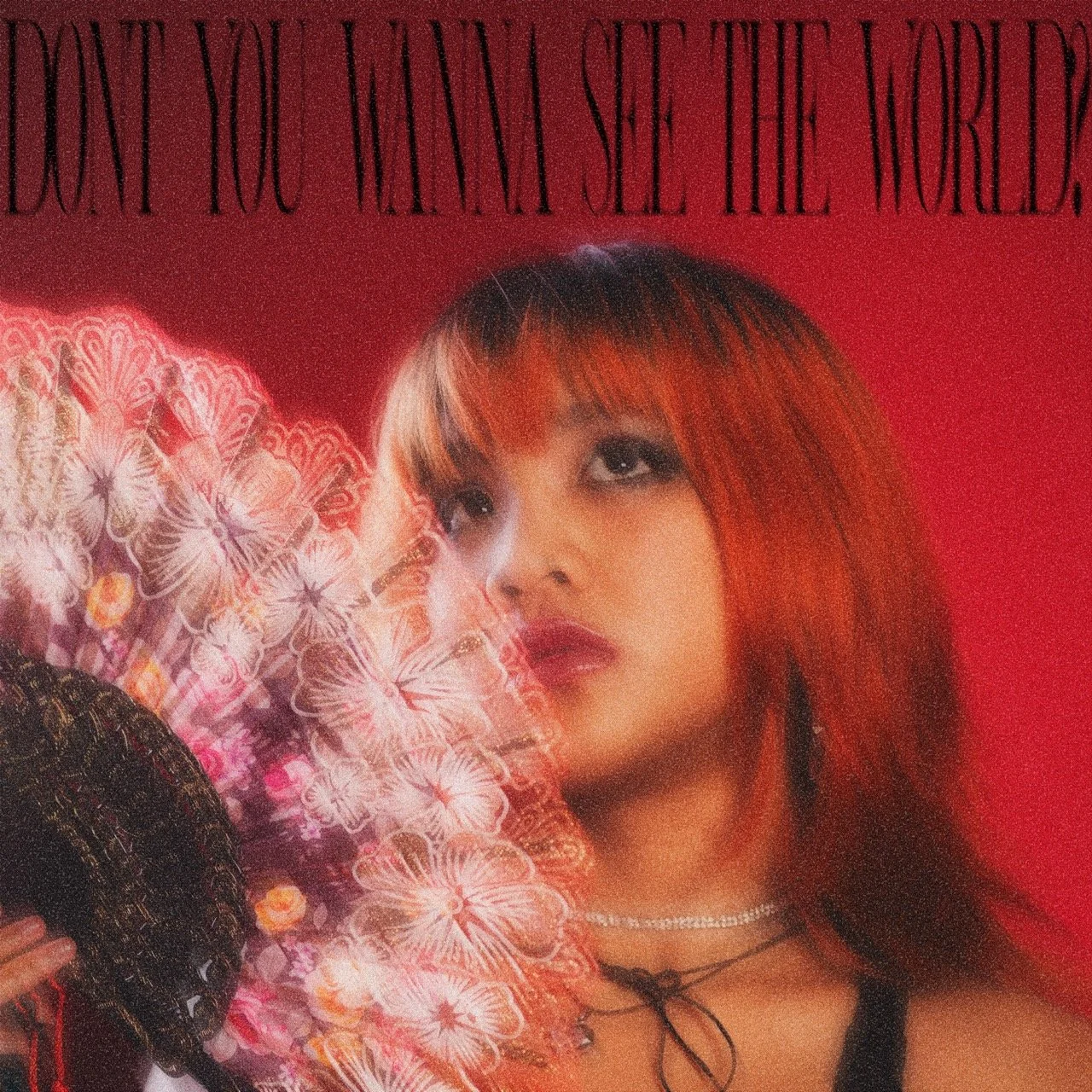
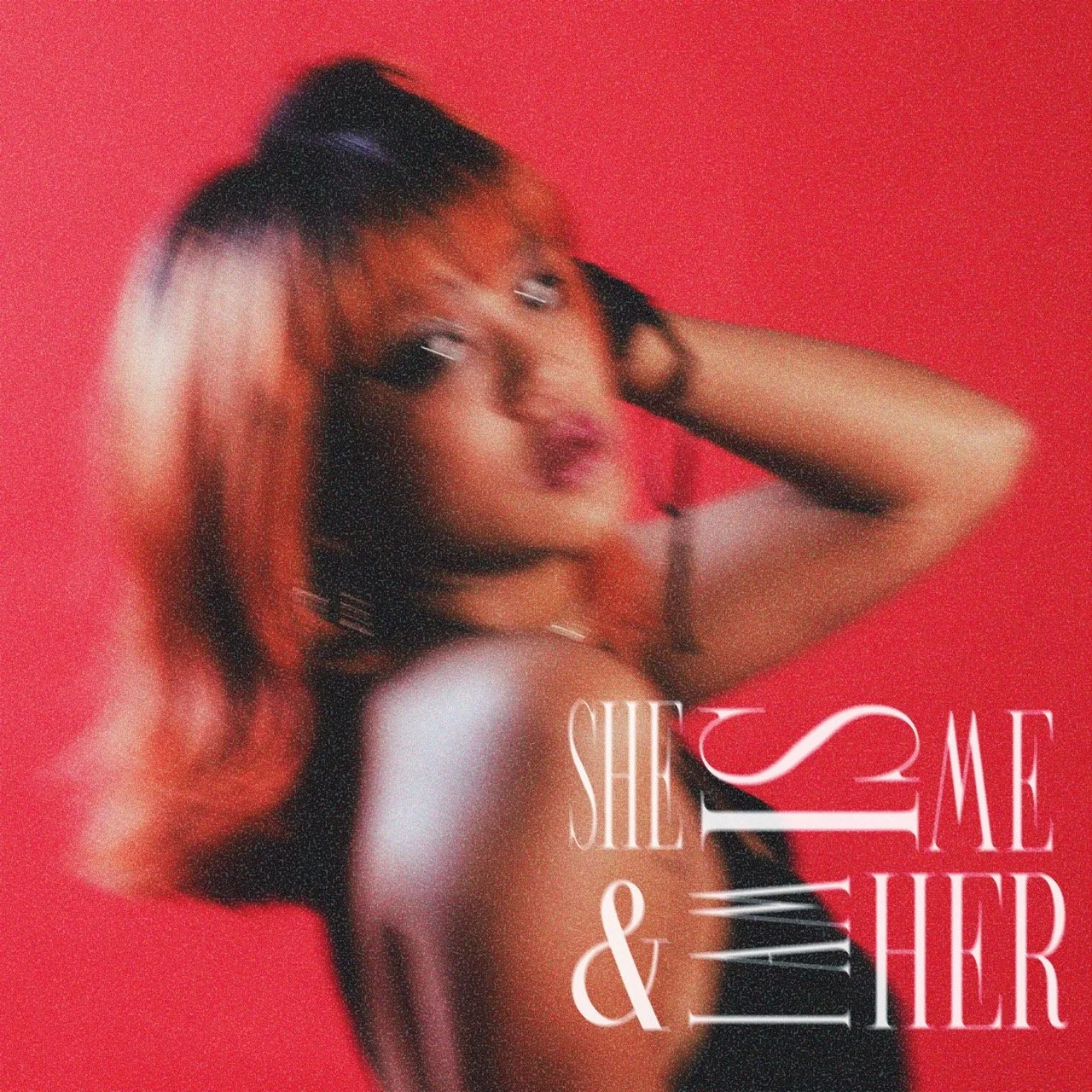
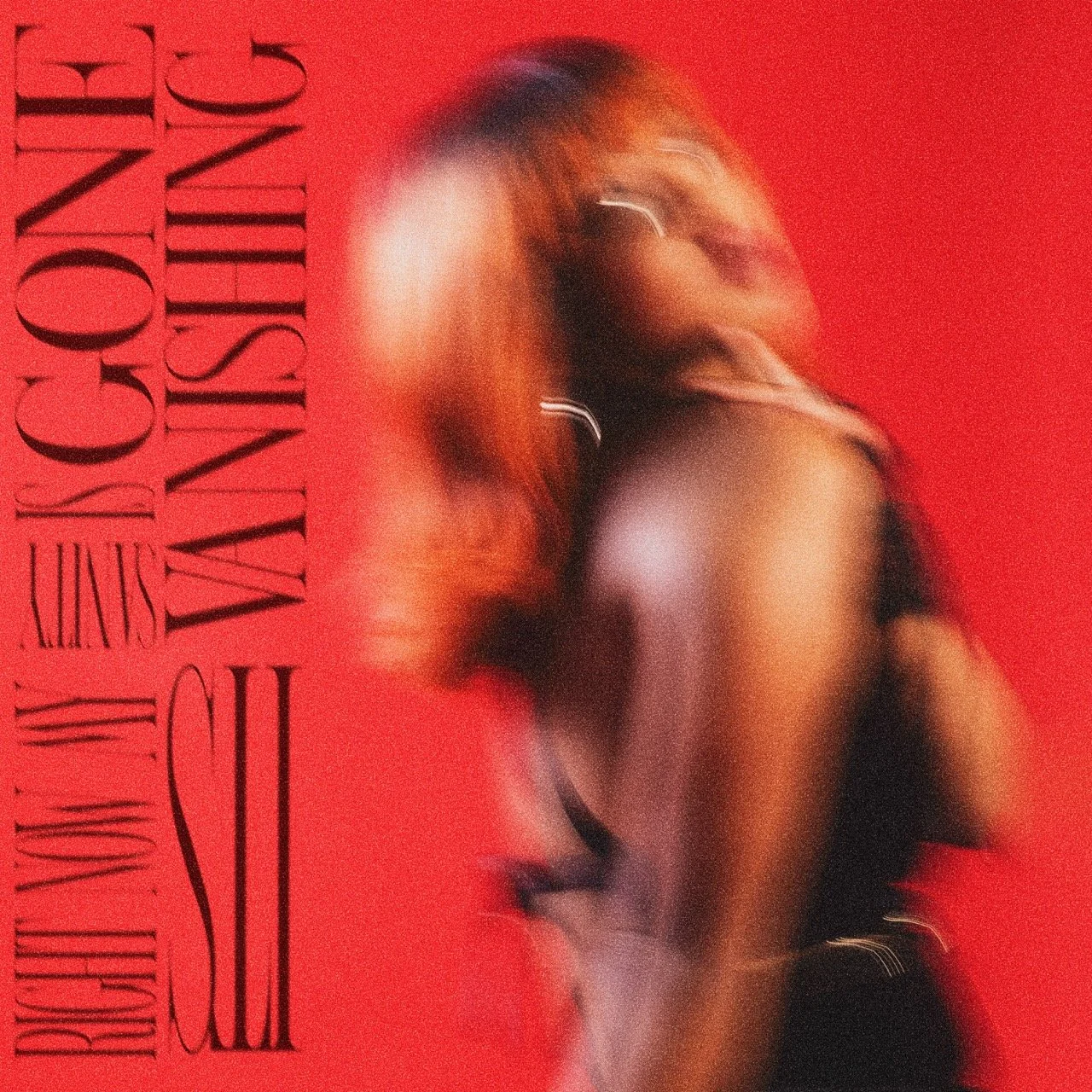
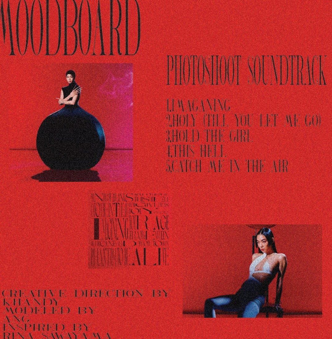
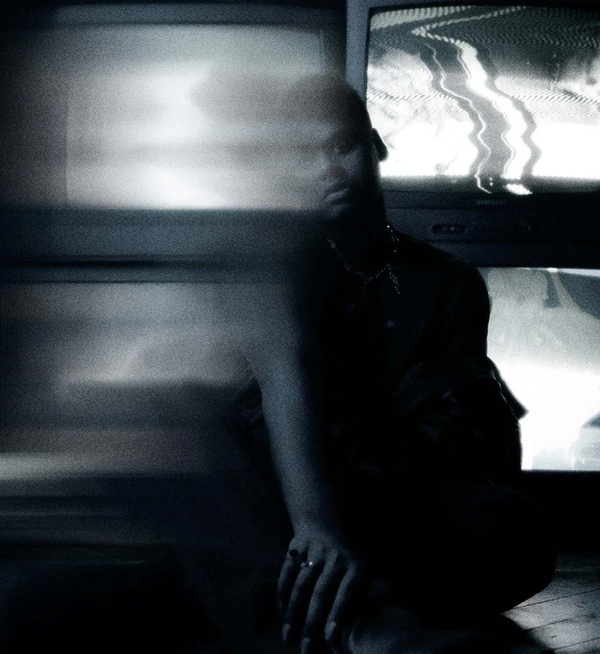
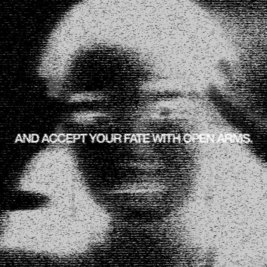
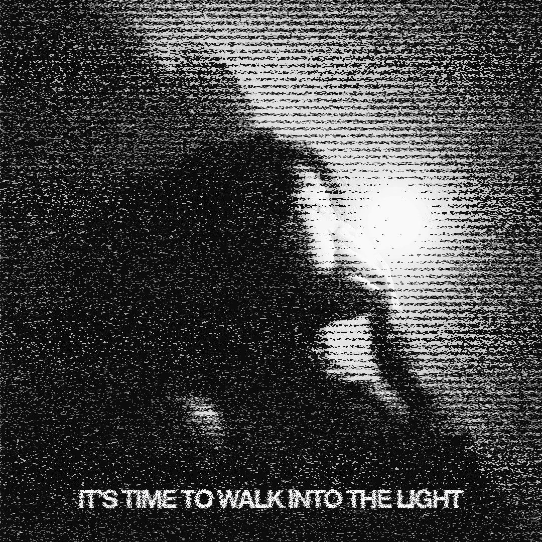
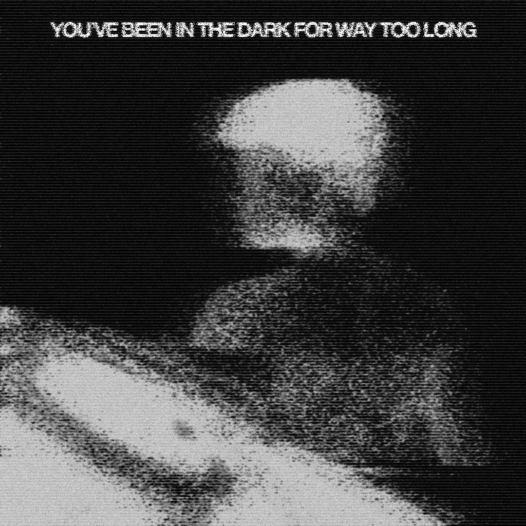
HOLD THE GIRL
Rina Sawayama is an exceptional artist with a very distinct art style that strays away from the average pop celebrity’s formula. The Hold The Girl vinyl follows a unique art style with a pop of red and eye-catching typography that switched between elongated and squeezed. This stylistic choice may reflect her message with this album; having to reparent herself after her childhood trauma as a queer woman—stretching herself in unnatural ways or finding ways to to fit into societal molds. I wanted to subtly reference these themes in my own way. The strong red and awkward typography was a necessity in my photoshoot. The intentional blur represents the feeling of not being able to see the world as other people do, as a queer being. The lyrics were carefully selected from certain songs off sawayama’s Hold The Girl album; these lyrics spoke to the subject in the photos, as a queer person of color.